We recently visited the Guinness Storehouse in Dublin where we were treated to some iconic branding… as well as a few pints of the black stuff!
When taking on a new project we always recommend that our clients tackle their brand first. For us, getting the brand right is one of the most important parts of the project. It’s where we set tone of the conversation our clients have with their target audiences. It helps us to establish the colour palette we’ll use and the type style we’ll apply across all of their marketing material, both traditional and digital.
Whilst being away on a short break to Dublin I decided to soak in some of the culture, as well as some of their famous black porter. If you’re a tourist in Dublin one of the must see attractions is the Guinness Storehouse. One of the most iconic brands that has become, not just a brand that represents a certain type of drink, but also a brand that is closely associated with the nation in which it’s made.
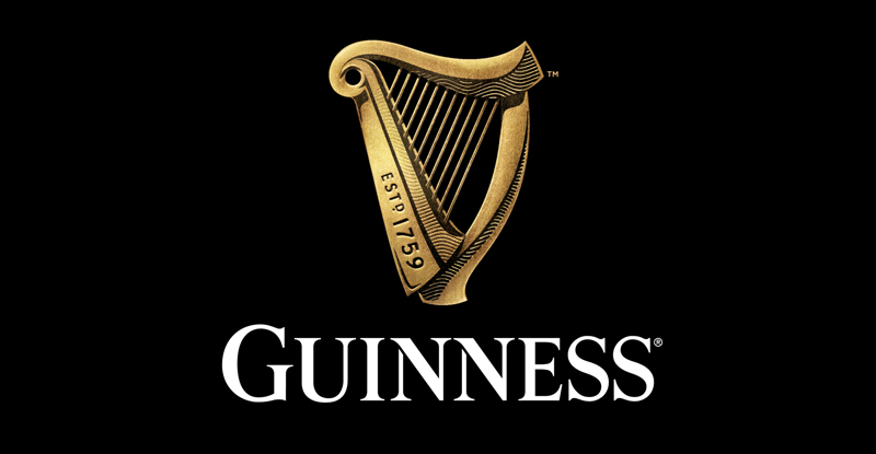
Apart from the Storehouse itself being an awe inspiring building, they have some great examples of how their world famous harp logo has been used over the years. The harp first appeared on bottles of Guinness in 1862 and over the years they have refined the symbol to make it relevant to the target audience of the day.
Enhancing iconic branding
They have recently unveiled the latest variation of the harp device and it’s harks back to a more traditional style with the use of a texture down the neck of the harp and the use of light and shade to make it almost 3d in appearance. Is it different from the last harp symbol, yes it is, is it still recognisable as Guinness, of course it is. They are expert at taking a timeless symbol and making it contemporary.
Whilst on my ‘grand tour’ of the Storehouse I also spent a rather long time in their advertising exhibition. From the famous John Gilroy advertisements of the 1930’s with the ‘Guinness is good for you’ and ‘Guinness for strength’ straplines, to the 1999 ‘Surfer’ advert with the horses emerging from a wave to the ‘Cogo Sapeurs’ adverts featuring some superbly dressed Congolese men. Their advertising has always been ground breaking and often times thought provoking.
In my opinion, Guinness is one of the best examples branding ‘done right’. From having an iconic symbol to some of the most memorable advertising of all time. To top it all off, it actually tastes amazing as well!
If you’re ever in Dublin I’d recommend a visit to the Guinness Storehouse, even if you’re not a drinker. It’s an excellent exhibition in a fabulous building.


